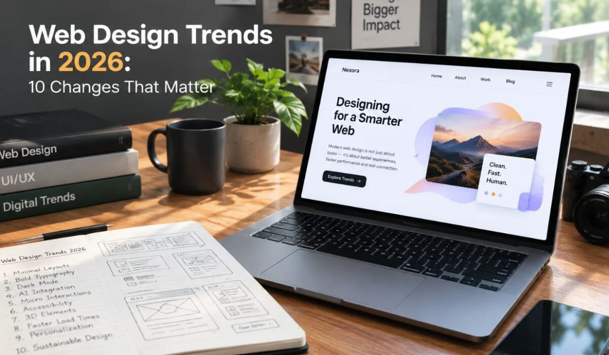
Web design in 2026 is about more than creating an attractive homepage. Visitors expect websites to load quickly, work smoothly on mobile devices, communicate clearly, and make important information easy to find. A visually impressive website can still lose visitors when its navigation is confusing or its pages are difficult to use.
The most useful web design trends in 2026 combine visual creativity with practical improvements. Flexible layouts, accessible interfaces, expressive typography, purposeful animation, and carefully applied AI features can help websites serve their audiences more effectively. However, not every new design style deserves a place on every website.
This guide explores 10 important web design trends, explains where each one fits, and shows how website owners can apply them without sacrificing usability, performance, or brand identity.
Quick Answer: What Are the Main Web Design Trends in 2026?
The main web design trends in 2026 include responsive layouts, accessible interfaces, expressive typography, editorial-style layouts, lightweight animations, personalized experiences, AI-assisted features, optimized images, reusable design systems, and privacy-conscious design. The most appropriate choices depend on a website’s audience, purpose, budget, and technical requirements.
1. Responsive Design That Adapts to Different Screens
Responsive design remains a fundamental part of modern website development. Rather than forcing the same fixed layout onto every device, a responsive website adjusts its content, navigation, images, and components to the available screen space.
This matters because visitors may access the same website from a phone, tablet, laptop, or large desktop monitor. A layout that works on a desktop can become difficult to navigate when columns become too narrow or buttons are placed too close together.
Modern responsive design also involves more than adjusting a page at a few predefined screen widths. Flexible grids, scalable typography, responsive images, and container queries can help individual components adapt to their surroundings. Google’s web.dev guidance explains how responsive design can also support accessibility by allowing content to reflow when users zoom in.
How to apply it: Test important pages at different viewport widths. Check whether headings wrap naturally, images remain clear, menus are easy to operate, and users can read content without horizontal scrolling.
2. Accessibility Becomes Part of the Design Process
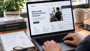
Accessible web design helps people with different abilities use a website. This includes visitors who navigate with a keyboard, use screen readers, zoom in on text, or have difficulty distinguishing certain colors.
Accessibility is most effective when considered during the design process rather than added as a final technical fix. Good color contrast, descriptive links, visible keyboard focus, properly labeled forms, meaningful image descriptions, and logical heading structures all contribute to a more usable experience.
The WebAIM Million 2026 report evaluated one million website homepages and found widespread detectable accessibility issues. Its findings highlight the importance of testing rather than assuming that a modern-looking interface is accessible. Source: WebAIM
How to apply it: Check text contrast, test navigation without a mouse, add useful alternative text to informative images, and make form errors understandable. Automated accessibility tools can help identify issues, but manual testing is still important.
Accessibility should be treated as an ongoing quality requirement, not simply a visual trend or an SEO trick.
3. Expressive Typography Creates Stronger Visual Identity
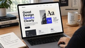
Typography plays a major role in how visitors understand and remember a website. In 2026, designers can use distinctive typefaces, stronger heading hierarchies, and more deliberate combinations of font sizes to give websites a recognizable identity.
For example, a digital magazine might use a bold display font for its main headlines and a highly readable typeface for article text. A software company might choose a restrained sans-serif style to communicate clarity and technical confidence.
The goal is not to make every heading oversized. Excessively large text can push useful content below the fold, create awkward line breaks, and make mobile layouts harder to use.
How to apply it: Choose a limited set of complementary fonts, establish consistent heading sizes, and keep body text comfortable to read. Use fluid typography where appropriate so text can scale naturally between smaller and larger screens.
A clear typographic system can make a website feel more professional without requiring elaborate graphics or complex animations.
4. Editorial-Style Layouts Make Content Easier to Explore
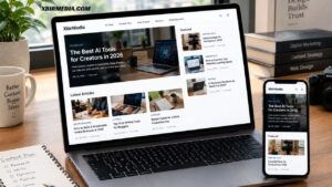
Editorial-style web design takes inspiration from digital magazines, newspapers, and carefully organized publications. It uses clear visual hierarchy, intentional whitespace, prominent headlines, and structured content sections to guide readers through information.
This approach is particularly relevant to blogs, online magazines, educational websites, and publications covering several topics. A well-organized layout can help visitors distinguish featured stories from recent articles, navigate categories, and discover related content.
However, an editorial layout should not become an excuse to fill a homepage with too many cards, banners, or competing headlines. Too many visual elements can make it difficult to identify the most important information.
How to apply it: Establish a clear homepage hierarchy. Give featured content a defined position, use consistent article cards, and make category navigation easy to understand. On article pages, prioritize the headline, introduction, main content, and related reading.
For a publication such as XbirMedia, a structured editorial layout can help readers explore technology, AI tools, creator technology, reviews, and digital business content without making the homepage feel crowded.
5. Microinteractions and Purposeful Animation

Microinteractions are small visual responses to user actions. Examples include a button changing appearance when selected, a navigation menu opening smoothly, or a form displaying a clear confirmation after submission.
When used thoughtfully, these details make interfaces feel responsive and help users understand what is happening. Animation can also communicate relationships between interface elements or draw attention to an important action.
The problem starts when motion becomes more important than usability. Large animated backgrounds, excessive scrolling effects, and unnecessary transitions can distract visitors and add technical complexity.
How to apply it: Use short, restrained animations for meaningful interactions. Ensure buttons provide clear feedback, navigation remains predictable, and important content does not depend on animation to become visible. Respect users’ reduced-motion preferences where supported.
A useful rule is to ask whether an animation helps the visitor understand or complete an action. If it does neither, remove it.
6. Lightweight, Performance-Focused Websites
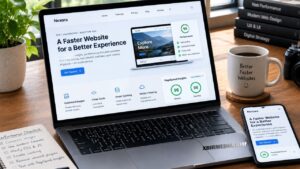
Website performance is an essential part of the user experience. Visitors may leave when a page takes too long to display useful content or becomes difficult to interact with. Heavy images, unnecessary scripts, excessive third-party tools, and poorly optimized themes can all contribute to these problems.
Performance-focused design considers loading speed from the beginning. Instead of designing a complex page and trying to make it fast afterward, developers select suitable assets, limit unnecessary effects, and avoid adding features without a clear purpose.
Google’s web.dev resources explain how to measure and improve web performance through Core Web Vitals and related development practices.
How to apply it: Compress images, use modern image formats where appropriate, specify image dimensions, remove unused plugins and scripts, and test pages with PageSpeed Insights. Pay attention to loading, interaction responsiveness, and layout stability.
For WordPress websites, a lightweight theme and carefully selected plugins can make maintenance easier. However, results depend on the hosting environment, page design, caching, and other technical factors.
Fast pages do not automatically guarantee higher rankings, but good performance helps visitors use a website more comfortably and can support a stronger overall experience.
7. AI-Assisted Features With a Clear Purpose
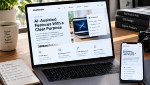
AI is becoming part of website creation and user-facing functionality. AI website builders can help generate initial layouts, suggest text, and speed up early design work. Existing websites can also use AI-assisted search, support tools, or content recommendations where these features suit the audience.
However, adding an AI feature simply because it is available does not necessarily improve a website. A chatbot that gives inaccurate answers or a recommendation system that distracts users can create more problems than it solves.
AI-generated content and designs also need human review. Brand consistency, factual accuracy, accessibility, privacy, and usability should remain part of the process.
How to apply it: Start with one specific problem. For example, an online store might evaluate an AI product-finding assistant, while a large documentation website might explore a search tool that helps visitors locate relevant information. Test the feature with real tasks before making it prominent.
AI works best as a practical addition to a well-designed website, not a replacement for clear navigation and reliable information.
8. Personalization Without Unnecessary Complexity
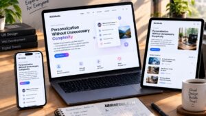
Personalization changes parts of a website according to relevant information about a visitor or their preferences. Depending on the website, this could include language selection, saved settings, relevant product recommendations, or content based on an explicitly chosen topic.
Useful personalization can reduce effort for returning visitors. For example, an educational platform might remember a user’s selected language, while an online store could make previously saved items easier to access.
Poorly implemented personalization can feel intrusive, produce irrelevant recommendations, or create privacy concerns. Collecting more data than necessary also increases the responsibilities associated with storing and protecting it.
How to apply it: Begin with simple, transparent features that offer clear value. Let visitors control important preferences, explain relevant data practices, and avoid collecting personal information that the feature does not need.
Personalization is not essential for every website. A straightforward publication or small business website may serve its audience better with clear categories and useful navigation.
9. Image Optimization and Authentic Visual Content
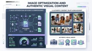
Images help visitors understand products, recognize a brand, and engage with editorial content. In 2026, choosing and presenting images thoughtfully remains an important part of effective web design.
Authentic photographs, relevant product images, original diagrams, and carefully selected illustrations can give a website a distinctive visual identity. The right choice depends on the subject. A software tutorial may benefit from a genuine interface screenshot, while a travel article may need location-specific photography.
Large, poorly compressed images can slow down pages. Generic stock images can also weaken a publication’s identity when they do not support the subject.
How to apply it: Choose images that directly support the surrounding content. Compress files, use suitable dimensions, provide descriptive alternative text when appropriate, and avoid loading large images unnecessarily. Use image captions when additional context helps readers.
For XbirMedia, original featured images and relevant screenshots can help technology articles look more distinctive. Any generated or stock imagery should be accurate, appropriately licensed, and clearly relevant to the article.
10. Reusable Design Systems Create Consistency
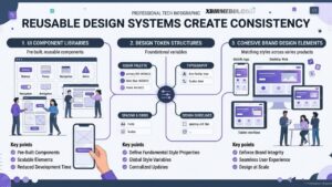
A design system is a collection of reusable visual rules and components. It may include colors, typography, spacing, buttons, navigation patterns, form styles, and article-card layouts.
Consistent components help visitors recognize familiar interface elements across a website. They can also make updates easier because designers and developers do not need to recreate every component for every page.
This is especially useful for websites that publish frequently or cover several subjects. Without shared design rules, different sections can gradually develop inconsistent fonts, spacing, buttons, and layouts.
How to apply it: Define a small set of brand colors, typography styles, spacing rules, and reusable components. Document how these elements should be used, then review new pages against the same standards.
A design system does not have to be complicated. A small publication can begin with a consistent header, navigation menu, article template, category layout, and footer.
Comparison Table: Which Web Design Trends Should You Prioritize?
| Trend | Main benefit | Priority for most websites |
|---|---|---|
| Responsive design | Usability across devices | Essential |
| Accessibility | More inclusive experiences | Essential |
| Expressive typography | Clear hierarchy and identity | High |
| Editorial layouts | Easier content discovery | High for publishers |
| Microinteractions | Clearer interface feedback | Medium |
| Performance-focused design | Faster, smoother pages | Essential |
| AI-assisted features | Help with specific tasks | Depends on need |
| Personalization | More relevant experiences | Depends on audience |
| Optimized imagery | Better visuals and efficiency | High |
| Reusable design systems | Consistency and easier maintenance | High for growing sites |
These priorities are practical guidance, not a universal ranking. A small portfolio, an online store, and a digital magazine have different needs, so the right implementation will vary.
How to Choose the Right Web Design Trends for Your Website
You do not need to adopt all 10 trends at once. Start by identifying the biggest problems visitors experience and the outcomes your website needs to achieve.
1. Review the current user experience. Check navigation, readability, mobile layouts, forms, and the path visitors follow to find important information.
2. Fix foundational problems first. Address broken layouts, slow pages, inaccessible controls, and confusing navigation before investing in decorative effects.
3. Match the design to your audience. A publication needs readable articles and effective content discovery. An online store needs clear product information and a straightforward checkout. A portfolio needs strong project presentation.
4. Introduce changes gradually. Update one important part of the website at a time. This makes it easier to identify what improves usability and what creates new problems.
5. Measure the results. Use analytics, performance reports, feedback, and task testing to understand how visitors respond. Do not assume that a design is successful simply because it looks modern.
Common Web Design Mistakes to Avoid in 2026
Following trends without considering the audience can make a website harder to use. Avoid these common mistakes:
- Adding unnecessary animation: Motion should support an interaction rather than distract from the content.
- Ignoring mobile visitors: Check actual layouts and functionality on smaller screens, not just a desktop preview.
- Choosing style over readability: Decorative fonts, weak contrast, and crowded layouts can make information harder to understand.
- Installing too many plugins: Additional tools may introduce maintenance, security, compatibility, and performance concerns.
- Using AI output without review: Check generated text, images, and interface suggestions before publishing.
- Redesigning without a clear objective: Identify the problem the redesign should solve and evaluate the outcome afterward.
The goal is not to make a website look like every other modern design. It is to create an experience that suits the audience and supports the site’s purpose.
Final Thoughts
The most useful web design trends in 2026 combine modern presentation with practical functionality. Responsive layouts, accessible interfaces, readable typography, optimized imagery, and performance-focused development provide a strong foundation. AI, personalization, and animation can add value when they solve specific user problems.
For website owners, the best approach is selective improvement rather than following every trend. Understand your audience, identify what makes the current experience difficult, and prioritize changes that make the website easier to use.
For XbirMedia and other digital publications, that means putting readable content, intuitive category navigation, consistent article layouts, and fast-loading pages first. A website does not need every new design effect to feel current. It needs a clear identity, reliable information, and an experience that gives readers a reason to return.
Frequently Asked Questions
What are the biggest web design trends in 2026?
Important trends include responsive layouts, accessible design, expressive typography, editorial-style pages, purposeful animation, performance optimization, AI-assisted features, personalization, optimized imagery, and reusable design systems. Their usefulness depends on the website’s goals.
Is responsive web design still important in 2026?
Yes. Responsive design helps websites adapt to different screen sizes and zoom levels. It supports usability across devices and can make content more accessible.
Does modern web design improve SEO?
Good web design can support SEO through clear navigation, accessible content, mobile usability, strong performance, and a logical page structure. However, a modern visual style alone does not guarantee higher rankings.
Should every website use AI features?
No. AI features are useful when they solve a genuine problem, such as helping visitors search a large knowledge base. Websites that do not need these capabilities can focus on simpler, more reliable interfaces.
Are animations good for website user experience?
Animations can make interactions easier to understand when they provide useful feedback. Excessive motion can distract visitors, affect performance, or create accessibility barriers.
How often should a website be redesigned?
There is no fixed redesign schedule that suits every website. Review performance, usability, branding, accessibility, and business needs regularly. Make targeted improvements when they address a real problem rather than redesigning simply because a new trend appears.
What is the most important web design principle for beginners?
Start with clarity. Make it easy for visitors to understand what the website offers, find the information they need, and complete their intended task. Build visual style around those priorities.