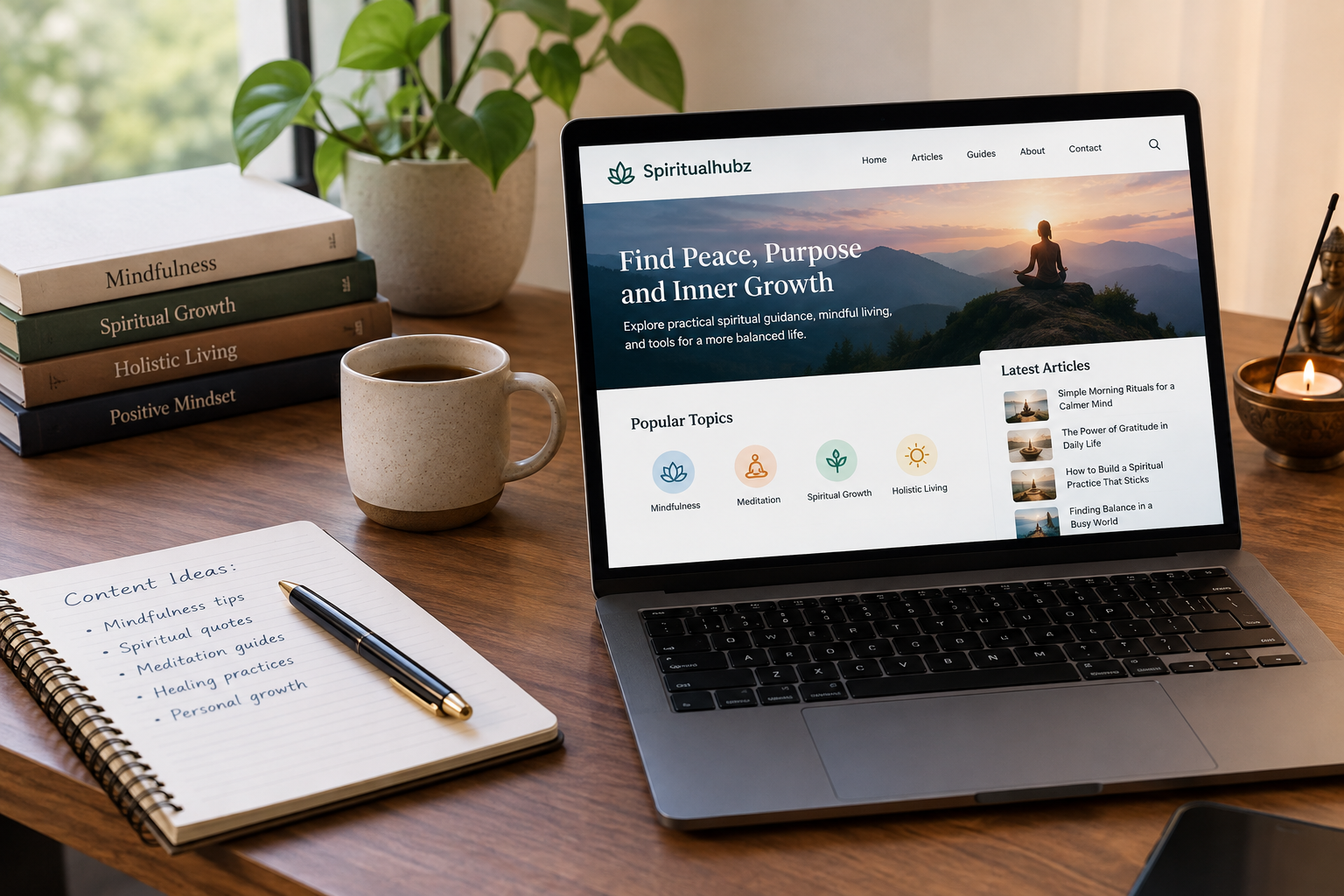

A website can look impressive in a screenshot and still frustrate visitors when they try to use it. Slow pages, confusing menus, oversized animations, and poorly designed mobile layouts can undermine an otherwise attractive design.
The web design trends in 2026 worth following address these practical problems. Artificial intelligence is changing how designers create interfaces, while accessibility, responsive layouts, and performance remain essential to a useful website. At the same time, brands are looking for distinctive visual identities instead of relying on the same templates and color schemes.
For independent creators, SaaS founders, and digital publishers, the challenge is choosing changes that support a clear business goal. A trend deserves attention when it helps visitors find information, understand an offer, complete a task, or trust a brand.
QUICK ANSWER
The most useful web design trends in 2026 include AI-assisted design, personalized interfaces, expressive typography, purposeful motion, responsive layouts, accessible navigation, lightweight pages, modular design systems, interactive product demonstrations, and clearer content structures. Businesses should prioritize mobile usability, accessibility, and loading performance before adding visually demanding effects. Google’s Core Web Vitals provide measurable performance targets: Largest Contentful Paint (LCP) should be 2.5 seconds or less, Interaction to Next Paint (INP) should be 200 milliseconds or less, and Cumulative Layout Shift (CLS) should be 0.1 or less at the 75th percentile. These measurements help teams evaluate real user experiences. The right design choices depend on the audience, website purpose, available budget, and results from actual testing.
KEY TAKEAWAYS
- AI-assisted design: Use AI to generate early concepts and variations, then review the results for accuracy, usability, and brand consistency.
- Performance targets: Aim for LCP at or below 2.5 seconds, INP at or below 200 milliseconds, and CLS at or below 0.1.
- Accessibility: Use WCAG 2.2 as a practical reference for readable content, keyboard navigation, focus visibility, and accessible controls.
- Business value: Test design changes against meaningful outcomes, such as sign-ups, article engagement, purchases, and completed forms.
1. AI-Assisted Web Design and Faster Prototyping
AI tools can help designers move from an idea to an early interface more quickly. A creator can describe a landing page, generate layout options, draft interface text, or explore different visual directions before committing to a design.
This is especially useful for small teams that cannot afford a large design department. A SaaS founder, for example, can use AI to explore a pricing page and compare different ways to present subscription plans.
However, generated designs often need substantial editing. AI may produce generic layouts, inconsistent spacing, inaccessible color combinations, or copy that makes unsupported product claims. It can also suggest components that are difficult to maintain in an existing content management system.
The practical approach is to treat AI as an assistant during early design work. Review every generated section, check its behavior on mobile devices, and test the final interface with real users.
Best application: Landing-page concepts, wireframes, design variations, and initial interface copy.
Main limitation: Generated output does not replace usability testing, technical review, or brand judgment.
2. Responsive Design That Adapts to Real User Needs
Responsive design remains a core requirement in 2026 because people visit websites on phones, tablets, laptops, and large displays. A layout that works on a desktop monitor may become difficult to read when its columns shrink on a phone.
Modern responsive design goes beyond reducing the width of a page. It considers how content should reorganize, which controls need larger touch targets, and how visitors complete tasks on different devices.
For a digital publisher, this means keeping article text readable, providing sufficient space around navigation controls, and avoiding intrusive overlays. A SaaS company should ensure that dashboards, forms, and account controls remain usable on smaller screens.
Use flexible grids, responsive images, relative sizing, and CSS media or container queries where appropriate. Test common screen widths, but do not assume that a page works simply because it fits inside the browser.
Practical test: Complete the site’s main task on a phone without horizontal scrolling, hidden controls, or awkward zooming.
3. Expressive Typography and Distinctive Visual Identity
Typography is becoming an important way for websites to stand apart from generic layouts. Large headlines, carefully chosen font combinations, varied text weights, and deliberate spacing can establish a recognizable brand without filling every section with decorative graphics.
For publishers, strong typography can make an article easier to scan. For SaaS companies, a clear hierarchy helps visitors distinguish the main value proposition from supporting details, pricing information, and calls to action.
The risk comes from choosing a typeface for appearance alone. Oversized headlines can push useful information below the fold, while thin fonts and low-contrast text may be difficult to read. Multiple web fonts can also increase page weight if they are loaded inefficiently.
Choose a small font family, define a consistent type scale, and test it on mobile screens. Use distinctive display typography where it adds character, then keep body text comfortable for longer reading sessions.
Best application: Editorial websites, creative portfolios, product landing pages, and brand-focused homepages.
4. Purposeful Animation and Interactive Feedback
Animation can make an interface easier to understand when it communicates a change in state. A menu can open with a short transition, a button can show that it has been pressed, or a progress indicator can explain that a form is processing.
The important distinction is purpose. Animation should help people understand an interface rather than delay them from using it.
Heavy video backgrounds, elaborate scroll effects, and continuous movement may increase page weight or distract visitors from important content. They can also create difficulties for people who prefer reduced motion.
Use CSS transitions for simple interactions and reserve more demanding animation for moments that benefit from it. Keep controls responsive, respect the user’s reduced-motion preference, and avoid making essential information dependent on an animation.
For a product website, an interactive demonstration may explain a complicated feature more clearly than a long promotional video. For a publisher, restrained motion can add polish without interfering with reading.
Practical test: If removing an animation makes the interface clearer or faster without reducing understanding, remove it.
5. Accessibility as a Standard Part of Design
Accessible design helps more people use a website, including visitors who rely on keyboards, screen readers, magnification, captions, or other assistive technologies.
It also improves ordinary usability. Clear labels, predictable navigation, readable text, and visible focus indicators help visitors complete tasks with less confusion.
The World Wide Web Consortium’s WCAG 2.2 accessibility guidelines provide testable criteria for accessible web content. They cover areas such as keyboard access, focus visibility, target sizes, and understandable interactions.
Start with practical checks. Confirm that every important control can be reached with a keyboard, links have meaningful names, form fields have labels, and text has sufficient contrast against its background. Images that convey information should have appropriate alternative text.
Automated accessibility tools can identify some problems, but they cannot reliably judge every interaction or the clarity of every label. Manual checks remain necessary.
Best application: Every website, especially online stores, SaaS platforms, public information sites, and content-heavy publications.
6. Faster Websites and Lightweight Visual Design
Performance is a design concern because page speed affects how quickly visitors can see and use important content. Large images, excessive scripts, third-party widgets, and unnecessary effects can make a page feel slow even when its layout is attractive.
Google’s Core Web Vitals guidance identifies three key measurements:
- Largest Contentful Paint (LCP): Measures when the main content becomes visible. Aim for 2.5 seconds or less.
- Interaction to Next Paint (INP): Measures responsiveness to user interactions. Aim for 200 milliseconds or less.
- Cumulative Layout Shift (CLS): Measures unexpected layout movement. Aim for 0.1 or less.
These targets apply at the 75th percentile of page visits, assessed separately for mobile and desktop experiences.
Design decisions influence these measurements. Compress images, use modern image formats where supported, reserve space for advertisements, and avoid loading unnecessary scripts before the main content. Use lazy loading for suitable below-the-fold images, but do not automatically lazy-load the primary hero image if it delays the main content.
A lightweight design does not have to look plain. Good art direction, carefully sized imagery, strong typography, and clear spacing can produce a distinctive page without excessive technical overhead.
Practical test: Check both field data from real visitors and laboratory results. A single speed test cannot represent every device or network condition.
7. Personalized Interfaces With Clear User Control
Personalization can make a website more relevant by adjusting content or recommendations to a visitor’s needs. An online store might suggest related products, while a SaaS platform might display recently used projects or relevant onboarding guidance.
AI can support these experiences by helping organize information or interpret user requests. However, personalization is most useful when it solves a recognizable problem rather than creating an interface that changes unpredictably.
For example, a software dashboard could show the tools a user regularly needs. A publisher might recommend articles within a category the reader has chosen to follow.
Personalization also creates responsibilities. Collect only the data required for the experience, explain relevant choices, and provide controls where appropriate. Avoid using sensitive inferences or presenting uncertain recommendations as facts.
Start with simple rules based on a user’s explicit preferences or recent activity. Add more complex personalization only when testing shows a meaningful improvement.
Best application: SaaS dashboards, membership websites, educational platforms, and online stores.
8. Modular Design Systems and Reusable Components
A design system gives a website a consistent set of colors, typography rules, spacing values, and interface components. Instead of building every page from scratch, teams can reuse tested patterns for navigation, buttons, cards, forms, and content sections.
This approach is useful for digital publishers with many articles and categories. A shared system helps keep headlines, author information, related posts, and calls to action consistent across the site.
SaaS companies benefit too. Reusable components reduce the chance that similar controls behave differently across product screens.
The initial setup requires time. Poorly planned component libraries can become difficult to manage when teams create too many variations or make shared components overly complicated. Reuse should reduce maintenance, not prevent sensible differences between pages.
Document the purpose of each component, define its supported states, and keep accessibility requirements in the shared pattern. Test updates carefully because a change to one reusable element can affect many pages.
Practical test: Update a common component once and confirm that the change appears consistently wherever the component is used.
9. Interactive Product Demos and Useful Micro-Interactions
Visitors often need to understand how a product works before they sign up or make a purchase. Interactive demos can answer that question by allowing people to explore a sample dashboard, preview a configuration, or test a small part of a service.
This is particularly useful for SaaS companies selling products that are difficult to explain with screenshots alone. A visitor could change a setting in a sample interface and immediately see what it does.
Micro-interactions support the same goal on a smaller scale. They can confirm that a form was submitted, show validation errors, or explain why a button is unavailable.
The trade-off is implementation cost. Interactive experiences may require additional code, testing, and ongoing maintenance. They can also perform poorly on low-powered devices if they depend on large libraries or complex animations.
Build a lightweight demonstration around the product’s most important task. Keep essential explanations available as ordinary text, and provide a clear alternative if the interactive component fails to load.
Best application: Software landing pages, service configurators, onboarding flows, and product comparison pages.
10. Clearer Content Structure for Search and Visitors
A well-designed website makes its purpose easy to understand. Visitors should be able to identify the page topic, find relevant sections, and understand what action they can take next.
Clear content structure matters for both usability and search visibility. Descriptive headings, meaningful internal links, informative page titles, and logical navigation help people understand how a page fits into the wider site.
For publishers, this means organizing articles into useful categories and making related content easy to discover. For SaaS businesses, it means separating product information, pricing, documentation, and support content so visitors can find the right resource quickly.
AI-powered search experiences make clear, factual writing especially useful because systems need understandable information to interpret and summarize. However, no heading structure or design technique guarantees that Google AI Overviews will cite a page.
Google’s guidance on helpful, reliable content recommends prioritizing content that genuinely helps people, demonstrates appropriate expertise, and provides value beyond what other pages already offer.
Use descriptive headings, explain technical terms, answer the page’s main question early, and support important claims with reliable evidence. Avoid creating repetitive pages solely to target slightly different keyword variations.
Practical test: Ask a new visitor to locate a specific answer or complete a common task. If the person struggles, improve the information architecture before adding more visual effects.
Comparison Table: Which Web Design Trends Should You Prioritize?
The following table compares the likely value and implementation effort of each trend. These are practical planning estimates, not results from a controlled benchmark. Actual costs and performance depend on the website, tools, hosting, and development team.
| Trend | Main Benefit | Performance Consideration | Relative Cost |
|---|---|---|---|
| AI-assisted design | Faster concept development | Generated layouts still require review | Low to medium |
| Responsive design | Better mobile usability | Poorly sized assets can slow pages | Low to medium |
| Expressive typography | Stronger brand identity | Extra font files add weight | Low to medium |
| Purposeful animation | Clearer interaction feedback | Complex effects can affect responsiveness | Medium |
| Accessible interfaces | Easier use for more visitors | Requires ongoing testing | Low to medium |
| Lightweight design | Faster content access | Requires asset and script optimization | Low to medium |
| Personalization | More relevant experiences | Additional scripts and data processing | Medium to high |
| Modular design systems | Consistent layouts and easier maintenance | Poor component choices can add code | Medium |
| Interactive demos | Better product understanding | Heavy demos can slow initial loading | Medium to high |
| Clear content structure | Easier discovery and navigation | Usually supports a lighter page structure | Low to medium |
Relative cost assumes an existing website and varies with its technical condition. A redesign of an old site can cost more than adding a feature to a well-maintained one.
PRACTITIONER TIP
Before paying for a new theme, animation library, or AI design subscription, record your current performance and conversion measurements. Change one major element at a time, then compare the results over a meaningful period. Check mobile behavior, accessibility, and page speed after each major change. This makes it easier to identify whether the redesign helped or introduced new problems.
How to Choose the Right Web Design Trends for Your Website
Trying to adopt all ten trends at once can create unnecessary work. Select changes based on the main problem your website needs to solve.
- For independent creators: Start with readable typography, responsive layouts, fast pages, and a clear path from article to related content.
- For SaaS founders: Focus on understandable product pages, accessible forms, useful interactive demos, and consistent interface components.
- For digital publishers: Improve article navigation, mobile reading, image performance, accessibility, and internal linking before adding complex personalization.
Review the results after launch. Use analytics to monitor meaningful actions, Search Console to understand search performance, and PageSpeed Insights or real-user monitoring to identify technical problems. Collect feedback from people who represent your audience.
A design change should earn its place through better usability, stronger content discovery, improved performance, or measurable business results. If a trend adds maintenance costs without helping visitors, it may not be worth adopting.
Final Recommendation
The most effective web design trends in 2026 combine visual identity with practical usability. AI can help teams explore ideas, distinctive typography can strengthen a brand, and interactive components can explain a product. Those improvements work best when visitors can still read the content, use the interface on mobile, and complete tasks without unnecessary delays.
For Xbir Media readers, the sensible starting point is a clear, accessible, fast-loading website with useful content and consistent navigation. Measure its current performance, identify the biggest usability problem, and introduce changes that address that problem directly.
Good design gives visitors a reason to stay, helps them find what they need, and makes the next step clear. That is a stronger long-term goal than following every new visual trend.
Frequently Asked Questions
What are the biggest web design trends in 2026?
AI-assisted design, responsive interfaces, expressive typography, accessible navigation, purposeful animation, lightweight pages, personalization, and reusable design systems are among the major areas receiving attention. Their value depends on how well they address a site’s audience and goals.
Is AI replacing web designers in 2026?
AI can speed up early concepts and repetitive design tasks, but it does not remove the need for creative judgment, accessibility review, user research, and technical implementation. Designers still need to determine whether a proposed interface is useful and appropriate for the people who will use it.
Which web design trend is best for SEO?
There is no single design trend that guarantees higher rankings. Clear page structure, useful content, mobile usability, accessible navigation, and good performance can support a better experience. Search visibility still depends on multiple factors, including relevance, content quality, competition, and technical accessibility.
Do animations improve user experience?
They can when they communicate state changes or make interactions easier to understand. Excessive animation can distract visitors, slow a page, and create accessibility problems. Use motion selectively and respect reduced-motion preferences.
How often should a website design be updated?
Update a website when user feedback, performance data, accessibility checks, changing business needs, or outdated functionality justify the work. A site does not need a complete redesign every year simply because new visual trends appear.